
The Annual Report….but not as you knew it

MailChimp 2015 Annual Report
This dropped into my inbox today.
Annual Reports are not usually the most interesting of topics, so what made this one so appealing?
1. Countup
 Brilliant – grabs attention from the off!
Take a well-known phrase, tweak it, then demonstrate its relevance – it could even be a new word for 2016?
Each number relates to a story, from 1 (Visits from a Mariachi Band) to over 203bn (number of emails sent), complete with click-throughs to the underlying story.
Very clever.
2. Scrolling
Rather than a standard click-through Report, this entices the viewer to keep on reading.
A changing background wallpaper with semi-opaque images relevant to the articles with an onscreen counter (to mimic the ‘Countup’ articles) adds visual interest and encourages ‘stickiness’.
3. Click-throughs
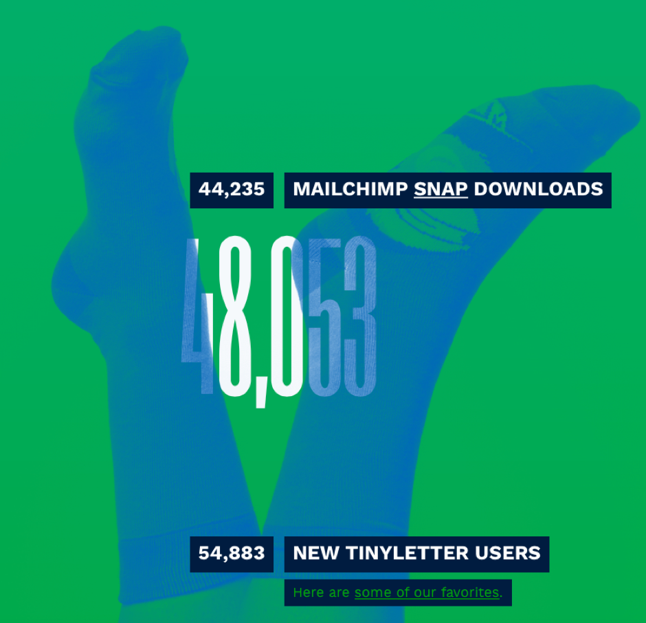 Did I know about Omnivore, TinyLetter, or MailChimp Pro beforehand?
Nope – they’ve all been features on MailChimp for a while, but they’d passed me by.
However, put this way the links are not a ‘heavy sell’;rather they’re intriguing and encourage you to click through.
Conclusion – Standard content + Imaginative presentation = Standout content
There is a lesson here for social media postings.
In an age of information overload, if you are trying to communicate a mundane or routine point, you need to craft your presentation especially carefully.
After all, if it’s worth spending the time writing it, you want people to read it.




Leave a Reply
Want to join the discussion?Feel free to contribute!