
Top Tips for creating a Brochure – Part 1: Layout
Brochure tips ‘n tricks
Here at Nobleword, we design a lot of brochures and see a lot of mistakes being made…..which we’d rather you avoided, so here are a few pointers:
1. Does a brochure really have to be A4?
Brochure n. a pamphlet or booklet, esp one containing summarized or introductory information or advertising [C18: from French brocher to stitch (a book)]
The standard definition of a ‘brochure’ suggests a small book, and maybe once upon a time we were limited to this format, but now the only limiting factor is our imagination.
- Paper size – can be A5, A6, tri-fold, bi-fold….etc
- Shape – selling pizzas; why not have a brochure in the shape of a pizza, or whatever your product is?
- Look – coated, glossy, matt, pop-out, hologram; e.g. high-end yacht brochures now commonly have small video screens inside which show walk-around tours.
2. Think online as well as hard copy
A brochure can be viewed online as well as in hard copy – in fact, there are some great programmes out there which allow readers to leaf through a brochure online, complete with the ‘swooshing’ sound that each page turn makes!
However, a few things to consider when re-using online for hard copy
- Picture quality varies – there’s lot of technical information here about dpi, ppi, and pixel areas, but in short, hard copy demands better quality images than online…..so you may need 2 versions of the same image.
- Check pdf download quality – these are great, as it allows you to distribute the same brochure electronically as well as physically. If using your Word programme to convert to a pdf, do check the final output though – cheap programmes have a habit of messing up the layout, so it’s a lot safer to have a web/graphic designer do this for you.
3. Professional layouts matter
Think smartphones.
Nowadays, everybody can take an instant digital photo, so why should anybody ever need to use a professional photographer ever again? The same goes for brochures which can be put together on home computers…but stop and consider for a moment:
- Technical know-how – heard of ‘print bleed’? This refers to the white spaces at the side of a document that can be trimmed off to allow the printer space to account for the movement of paper and design inconsistencies; i.e. if you try to cram too much into your layout, your brochure might be ‘cut off’ by the printer.
- Are your colours consistent? What you see on your screen isn’t necessarily what will you will see in print – the standard is the four colour offset print (generally called Euro-Scale) but this isn’t what your computer will use.
- Limit your fonts – again, not all fonts are created equal! Have a Style Guide with a simple heading structure detailing the various sizes, in the same corporate font as you use for your website – clarity is everything, and the use of a number of different fonts doesn’t translate into originality.
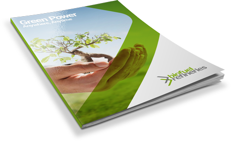
Note: the image for this blog depicts an A5, tri-fold brochure we produced for a locally-based Biofuel company. See how we put the ideas above into practise.



Leave a Reply
Want to join the discussion?Feel free to contribute!